3/28/12

Organic Modeling: ZSpheres

This week we briefly touched on ZSpheres as a way to block in your model.  Essentially ZBrush allows you to place and scale ZSpheres in 3D space.  It interpolates the distance between the spheres in a hierarchal manner and populates it evenly with other spheres.  it's almost like creating a rig for something that will turn into geometry later.


You can then create an adaptive skin using those spheres which will create a very rough base mesh for you to work on.  Retopology will be necessary later on, but this is just another tool that allows you to get to sculpting a more quickly.


As a side note, soon enough I will start working on my final project for this class.  I haven't ever done a female character before so I decided to do Felicia Day as her character from the short web series "Dragon Age: Redemption."  The majority of it will be done after my final presentation, but all in all, I think it will be rewarding.


Thesis Project: Kobol Utility Animation

I finally got my Final Review date: April 23rd, which happens to be the very first day of the presentations.  I have a lot to complete in order to meet those dates, so I am down to the wire on this.

This week I worked on a short utility animation showing how the pieces of the underbelly of the Kobol work.  There are two video clips here: one shows sort of the final look I am going for with some post processing effects like glow, lens flares, film grain, and heat ripples.  The other is the modified timing to slow down the action a bit.


If I was really focusing on the animation portion of this, I might add a little more random things like pitch and roll to it, but since it's only for showing how the pieces work and line up, this suits the purpose.

3/20/12

Thesis Project: Kobol Exterior Texture Maps

This week was a doozy for my head.  I spent the good part of the week doing the texture maps for the exterior of the spaceship.  Because this is a completely metallic ship, I had to be creative in how I approached the project.  Like last semester with my robot, I wound up linking the sixty or so shaders for the individual parts to a set of master shaders that controlled the majority of the shader values.  That way, when I want to tweak the settings, I am not having to go through all sixty shaders to do it.  It took quite some time and my mind got bored of reconnecting shader pathways, but it will pay off.


I didn't want to get too grimy on this spaceship and, in fact, there are a few parts that I need to go back and clean up a bit.  I wanted to show regular wear and tear, just enough to give it a sense of division and help the form read a bit better.  The panel lines needed to be very subtle and I added a little bit of ripple to the seams in order to get that sense of imperfection to the way it was created.


I added some structural details to the landing gear wells to give it a sense that there is some engineering behind all of this sleek exterior.  I also set up the engine flaps so that they can be animated easily by linking their X-rotation values together.  All of the geometry is set up in a hierarchy so that I can do a quick and dirty animation of this thing landing with all of its surfaces popping out.


I tried doing an afterburner using a procedural texture applied to the transparency and incandescence channels of the shader.  It still needs tweaking, but it can do the trick if I need it to.


I have a self-imposed deadline for this in order to feel like I am prepared for my final presentation.  In addition, the deadline for the spring show is coming up and I would like to enter in something of my best work in order to get a chance at talking to some recruiters.

3/19/12

Sunday Afternoon Sculpt: Barbarian Posed

I visited the barbarian sculpt this week and decided to try a few new things.  I have a lot to learn about morphology of the human body, but this was just for fun and learning anyway.  I used the ZBrush plugin Transpose Master to build a rig and pose this guy.  It allows you to do a quick and dirty rig so that you can move your mesh around and get it posed the way you like it.  After that, I did the skirt as a Dynamesh object and tried to sculpt it according to the pose.  In the industry, you would have someone doing a simulation of cloth for animation purposes, but for this I just sculpted it into place.  The sword was done in Maya and then imported into the scene.


All in all this was a worthwhile exercise and I learned a lot.  I didn't do all the surface details like pores and wrinkles, mainly because I got a little bored with this going back into it.  I tried using Fibermesh to do some hair on him, but it really looked terrible when I got it done.  I may explore it again in the future when I have a moment.

3/15/12

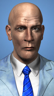
Organic Modeling 2: Midterm Project – Being John Malkovitch

 Here is the final composited rendering from ZBrush of my midterm project.  Overall, it's not bad and I learned a lot of stuff about ZBrush and some of the new features that are available.


The above image was rendered out in passes in ZBrush and then composited in Photoshop with a few added filters and adjustments.  You can export your image straight from ZBrush, but it helps the overall effect if you have some control on the individual elements that make up a rendering.


Because my class works in ZBrush 4R2 and I have both ZBrush 4 and 4R3, I mostly work in just 4 for the class work.  ZBrush isn't backwards compatible, so there were a few tricks I had to pull to get it to work.  I created the stubble and the eyelashes in Fibermesh in 4R3 and then exported them out as OBJ files to import into ZBrush 4.  It works okay for this instance, but I would rather work just in 4R3 for the hair stuff.


The above images are the different passes that I used to make the final image.  Respectively, the passes are the beauty (color), shadow, occlusion, depth, and mask.  The color starts off as your base layer and you use the rest to enhance it.  You can also render out separate light passes, but the diffuse and specularity of the color pass was good enough for my purposes.  You then layer the shadow and occlusion passes on top of the color pass and set their transparency to multiply.  That takes all the white values in those layers and makes them transparent so they darken the image below it.  Using the mask pass, you can cut your image off of the rendered background and put a new background color in.

Finally, the depth pass is more of an informational pass you can use in the Lens Blur filter in Photoshop to create a depth of field effect.  The pass essentially starts at the foremost part of your model and assigns a color value from white to black as your model extends away from the camera.  You can then use those values to tell the Lens Blur filter where you want to be in focus and how much the rest of the image is blurred.

Rendering in ZBrush isn't my favorite thing and I have to admit that I had a bunch of weird glitches with the program while trying to do so.  Once the shadows and occlusion wouldn't render.  Another time, they would only render black.  Some times things break for no apparent reason in ZBrush, but we still use it because it's such a powerful program for 3D stuff.

3/14/12

Thesis Project: Kobol Shaders – First Pass

This past week was spent doing more technical things to get ready to texture the model.  I started off by reusing the brass and chrome shaders from my robot, as well as the HDRI image I used for lighting.  Right now there is a lot to be done with textures and I have to be clever in how I go about doing it.


 I added some glow in Photoshop after the fact, just for kicks.

The biggest challenge this week was working with lights and mental ray shaders in Maya.  What you see in the following renderings are just raw shaders with no texture maps applied.  I did do some effects with some procedural texture nodes from Maya, but the rest are just the shaders.  They are going in the direction that I want, but I have a long ways to go before I feel like they are finished.


I used the Mental Ray architectural shaders for pretty much everything in the interior since it is supposed to be shiny and new.  They don't have a separate specular channel and everything is reliant on reflective properties.


Each of these frames took around 25 minutes to render with medium settings.  I will need to increase the number of samples for each shader which will increase render times when I go to do the final versions.

Just as a side note, the velvet for the couches was something I had to think creatively about, and I'm not quite sure that it is there yet.  I plugged a Ramp shader into the diffuse channel of the shader and attached a sampler node to the shader.  Essentially, what is does is samples the normals of the model of the couch.  Anything that is facing the camera gets a certain color applied to it while the rest changes color as it gets farther away.  It needs work, but it is a good way to fake the specular highlight that hits at the edge of something with tiny fibers on it.


I used Final Gather with these renderings, which smooths out the lighting in your scene quite a bit.  It helps illuminate the darker areas that aren't directly hit by light.  Also, geometry with ambient materials applied to them give off "light" that illuminates the surrounding surfaces.  It's fairly good for faking real world light bounces.


I have a lot of texture work to do and because I don't know when I am presenting, I have to pretend that I only have a month to complete it all.  Some surfaces will only require a bump map, and the shading will be able to do the rest.  Others might require bump and color.  Still others might require some fancy work with the reflection.

3/12/12

Sunday Afternoon Sculpt: Barbarian Work in Progress

I was interested in doing a full figure for one of these weeks, which is always much more complex than just doing a head.  I decided to revisit the mesh that I had made for the super hero sculpt a few months back to do some sort of barbarian warrior or something.  I really wanted an excuse to do a bulked out muscular human male.


This is just a start for now.  I spent most of the time blocking in and detailing the anatomical details.  I had to make some significant changes to the base mesh like putting in eye sockets and making the head more proportional to the rest of the body, but it looks closer to what I would like to see.

Next week I plan on posing him in a dynamic action pose and adding details like a sword and a leather skirt or something.  I've also learned quite a bit about hair in ZBrush, so I might try that out as well.

3/10/12

Organic Modeling 2: Midterm Project Textures & Shaders

I'm not finished with this one, but I am getting a lot closer.  I was able to gather a lot of real textures from photos of Mr. Malkovitch himself and use ZBrush's spotlight feature to paint them on.  I was quite pleased with the results.


I tried adding some stubble and hair for the renderings, but it's not quite there yet.  There are a lot of things about Fibermesh that I learned this week from playing around with it and I might have to do another go-around on it to get it working.  I was glad that, even though they are small, I was able to get some eyelashes in there.  A subtle detail like that helps to make it even more real.


Materials and lights in ZBrush are actually more complicated than in Maya, so I felt very confused going into this.  I think I might have messed a few things up with the lighting that is casting that huge shadow on his chest, but I think I know what is wrong.  I am actually guessing at what a lot of the settings in ZBrush do because the documentation is so poorly written.  Either way, though, I am fairly pleased with the results I am getting from this project.  It makes me excited for future prospects.

3/7/12

Thesis Project: Kobol Interior Touches

This week I dealt with a lot of technical glitches with Maya.  For some reason, whenever I would zoom in the orthographic cameras really tightly, it would crash the program.  That can be very troublesome when you've put a lot of detail work into the model, but luckily, I was able to pull through it.

This week I don't have a lot that is visually different from last week because a lot of what I worked on was technical.  I spent a day and a half UV mapping the exterior elements of the spaceship.  It is going to require some tricky texture work and very large texture maps.  I hope that Maya can handle it all without crashing.  

Although most of what I did this week was technical, I did add a few elements to the bedroom:


I also decided to just have some fun last night and threw a spotlight and bunch of Mental Ray architectural shaders on some of the elements to give an idea of what I am going for in terms of materials.  It definitely adds some different flair to see shadows and color, so the feeling of the interior is going to become more defined as I go along.


I did some post processing to these images like adjusting the brightness and adding a bit of a glow to the brighter elements.  I plan on doing the same for the animated images.

3/5/12

Lazy Sunday Sculpt: Cartoon Guy Head with FiberMesh

I had one more in my head that I wanted to do.  I haven't tried doing cartoony proportions with ZBrush yet, so I thought I would give it a try.  I also did a trial run of a new feature they just released called Fibermesh.  It allows you to create "fibers" that will easily simulate hair.  There is some finessing that I don't know how to do yet, but I'll figure it out.  It's not much help in terms of animation, but if you're just doing illustrations, it works great.


3/4/12

Lazy Sunday Sculpt: Radioactive Alien Thing

This is just a practice/warm up sculpt on a Sunday afternoon.  I just wated to play with some more funk alien heads in ZBrush using Dynamesh.


3/1/12

Organic Modeling 2: John Malkovich Sculpt

I could spend hours in ZBrush having fun.  Projects in this class are something that I actually look forward to.  It's not the best work out there, by any means, but I have to admit that this is better than what I have previously done in ZBrush.


I added some more elements to the model such as the shirt, jacket, and tie.  I took the lowest resolution level of the head and exported it to Maya.  Using that as a reference, I made some quick 3D models of the clothing.  After that, I took the clothes back into ZBrush to add the wrinkles and textural details.  Once I start adding color to this, it will start to feel a lot more real.  I just learned about a few projection painting techniques in ZBrush with a feature called Spotlight.  It allows you to overlay an image and essentially paint the texture onto your model.  It's pretty nifty and with the few tests I have done, you can get some realistic results.  I also did some quick tests using ZBrush's new FiberMesh tools, which can create CG hair really easily.  It's not as customizable as Shave and a Haircut, but it does the trick for simple hair and fur.  I can't wait to get into that some more.

Organic Modeling 2: The Skin of the Head

We finished up our study of the human head this week by adding the skin layer over the other pieces.  It's not the best rendition of the human face I have ever done, but it has been helpful in establishing the shapes of the face once again by defining their underlying structure.  This will always come in handy in the future.